Reducing Time to Present to Hiring Managers from 15 days to 6 days
The Problem
User Problem: In the existing application of one of the core functionalities, Recruiters and HMs were facing tremendous challenges inviting candidates to an assessment test and it was a manual time-consuming process for them to move individual candidates along the process. This problem was mainly for our enterprise clients who are managing candidates in massive volume and for all the clients who have assessments as part of their screening process. The invitation was one of the main challenges another challenge that users were facing was to track where candidates were in their assessment process and once they had completed the test, then manually progress or mark them unsuccessful in the hiring process. The whole process was very cumbersome.
“Over 30k applications last year, with 300 jobs it's just too hard to look at each job, even if we can do bulk move, there are too many jobs to do the bulk move for each. Need to bulk move people in each of the 380 jobs - very tedious - so you bulk move 380 times” - KPMG
So, how do we support the Talent accusation team and Hiring Managers to Reject or progress candidates accurately & without delay?
For business: It was becoming the blocker for achieving faster ROIs and for growth acceleration by successfully launching/enhancing ATS-agnostic market-leading products that drive new revenue as it was blocking the 3rd party vendors to migrate and work with the PageUp system.
Project Summary
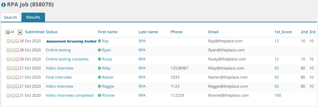
Before
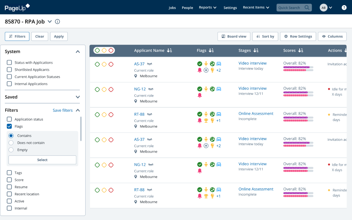
After
Goals

This was a massive game changer project for all the existing PageUp enterprise clients, as there was a pain point size of a mammoth when hiring for graduate roles. Recruiters had to manually track every candidate in the system to view their assessment scores and progress/reject them individually for a single role with 1000+ candidates, where they had more than 20 roles to fill.
So we came up with a new solution to take the user experience to the next level, where recruiters were taking more than 3.5+ weeks to progress the candidates in the enterprise organization now with the new designs they can do it within a day. This new solution allowed users to set their own scoring benchmark which helped them to progress/reject all the candidates in bulk within 3 clicks.
The catch was to build the user’s trust around the new functionality as it was a very unique way to progress/reject the candidates in bulk which needed some change support. Also building a new system parallelly to the existing system.
Audience: The main users for this project are recruiters working in enterprise organizations and HMs working in a decentralized mode.
Product goal:
The ultimate vision was to Empower HM to hire the right applicant easily and quickly and for this project, the main goal is to Reject or progress candidates accurately & without delay, and we’ll be able to achieve this by automating “low-value” interactions whilst enabling quality “high value” human interaction and decision making.
Business goal:
This will help the business achieve $1m in new revenue from newly launched ATS agnostic products and $2m+ new revenue generated from existing ATS agnostic products
Challenges
There were multiple high-on-user value gaps, with the lean approach we wanted to make sure we were prioritizing the right opportunity for the better adoption of the product.
I had to take the holistic design approach, and the experience of screening & selection has 2 sides of the coin. Managing candidates is managed by the NextGen team and Candidate experience is managed by the RecMarketing team, so the risk here was to deliver the product on time.
The assessment domain was tightly coupled to the monolith, so there were quite a lot of feasibility challenges to deal with.
Ultimately the goal was to replace the existing recruitment processes in PageUp which means there will be parallel products for the users to complete the same task and mitigate the risk of cognitive load and help users to reduce context switching and improve focus.
Design Process
In designing this project, we focused on three key things:
1. Address major risks upfront, such as value and business risks due to risky assumptions
2. Work together to find solutions across engineering, design, and product teams for a complete user experience
3. Emphasize problem-solving over adding features or following a roadmap.
The product approach consisted of three stages: Discover, Design, and Delivery.
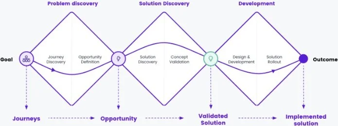
Discovery
CJM
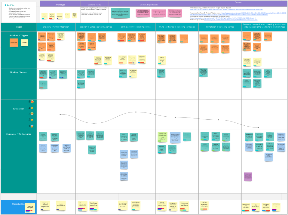
During the project discovery, we simplified our understanding of customer needs by mapping out their journey. This helped us see where we could improve and focus on key areas. By creating visual maps of customer experiences, we aligned stakeholders to make meaningful changes. I led sessions with internal teams and clients using insights from research and feedback. This session was guided by insights from previous user research, user feedback, CSAT, and feedback from lost opportunity/client.
We found two parts of the journey needing improvement: when customers decide to use the screening service and when reviewing results. We chose to prioritize improving the latter.
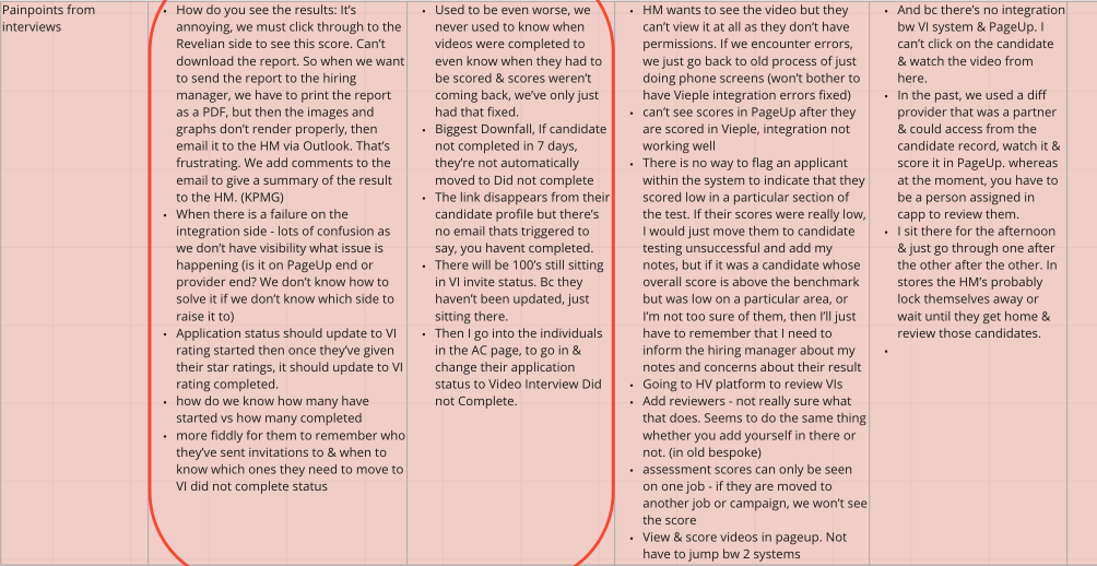
Coding CSAT
I did a synthesis of the CSAT scores and feedback around the assessment area to make sure it aligned with the segment identified from the CJM session and that was going in the same direction.
Data analysis
I studied the data of the existing system to understand the usage of the assessment using PowerBI and to study the usage pattern using the Heap analytical tool. This current date data gave us more confidence that we’ve prioritized the right opportunity and the numbers did say it was the most used page and flow in the core product, although the path users were taking didn’t make sense to us. Because from internal research we assumed that we need to uplift the UX of the assessment summary page and I was looking at the data from that lense.

User Interview with Usability Testing
I explored the opportunity to learn users' issues and goals by observing their task processes and challenges, as the data wasn't clear. I held sessions with 16 users, asking them to demonstrate how they assign assessments and navigate the current system.
We quickly identified 14 opportunities on synthesizing the interviews and the top 6 were:
Automatically progress or reject based on benchmarks + Adjust benchmarks depending on volumes
Keep track of assessment invitations
Recommend & rank assessed candidates but allow human decision-making
Combine other factors in addition to assessment scores to rank candidates
Easily assign screened candidates to be assessed by others + Add context to assessment results for Hiring Managers
View assessments seamlessly all in one place
Minimum eligibility criteria (prescreening) before inviting to assessment
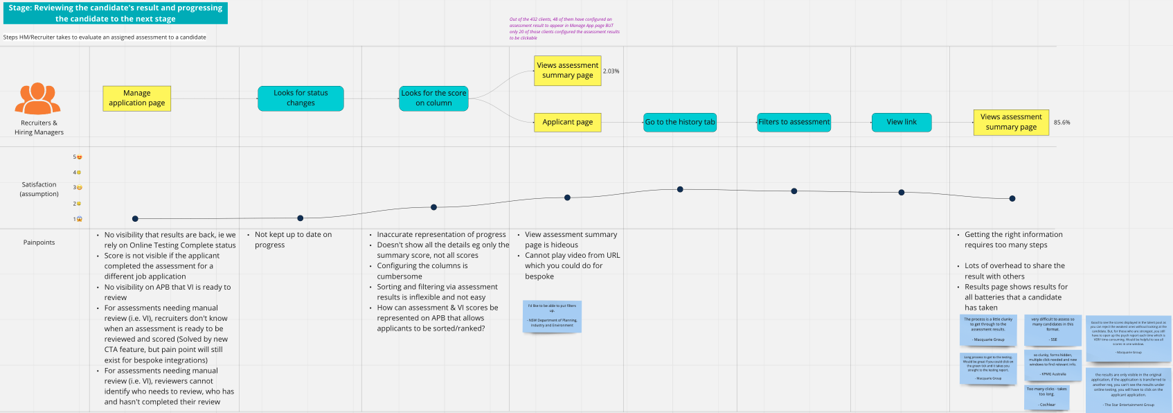
User flows
Understand user needs and frustrations at three stages: inviting candidates to assessments, screening service completion, and reviewing results to move to the next stage.
Market research and competitor analysis
On compiling the market research and competitor analysis, the common trends and solutions that we identified were based on automation to streamline the experience and non-linear workflows focusing on decentralization.
Summary
So the goal of this project is to support the Hiring team to Reject or progress candidates accurately & without delay, and by automating “low-value” interactions whilst enabling quality “high-value” human interaction and decision making. And those low-value opportunities were:
What needs my attention (in automated) progressing/rejecting in volume?
How can I quickly and easily identify the area that needs my attention in one place?
How can I quickly figure out how are the screening tasks progressing?
How many invites were sent, and what is their status?
Design
Ideation
I kicked off the design phase by planning and running the ideation workshop. With automation in mind, we wanted to design collaboratively the ideal flow to meet all the identified needs and create a desirable experience. In this workshop, we had cross-functional team pairing alongside the project team, making sure we bring in all the different aspects and come together in creating this desirable experience.
Usually, the ideation is done with one problem statement with one need to have the specificity to generate more meater ideas yet we took a different route as the goal was to take a holistic design approach to create a seamless end-to-end user experience of the whole platform.
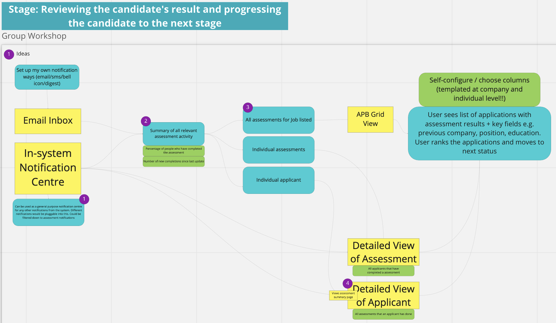
Idea prioritizations
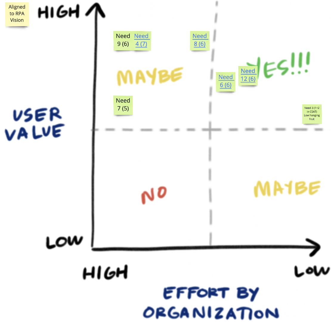
After generating a few ideas we took all the ideas to our value vs effort matrix, to identify the top ideas from the lens of usability, feasibility, and viability. Also, identify what are the low-hanging fruits (with high confidence) that our team can build quickly and ship it.
Translating ideas to design
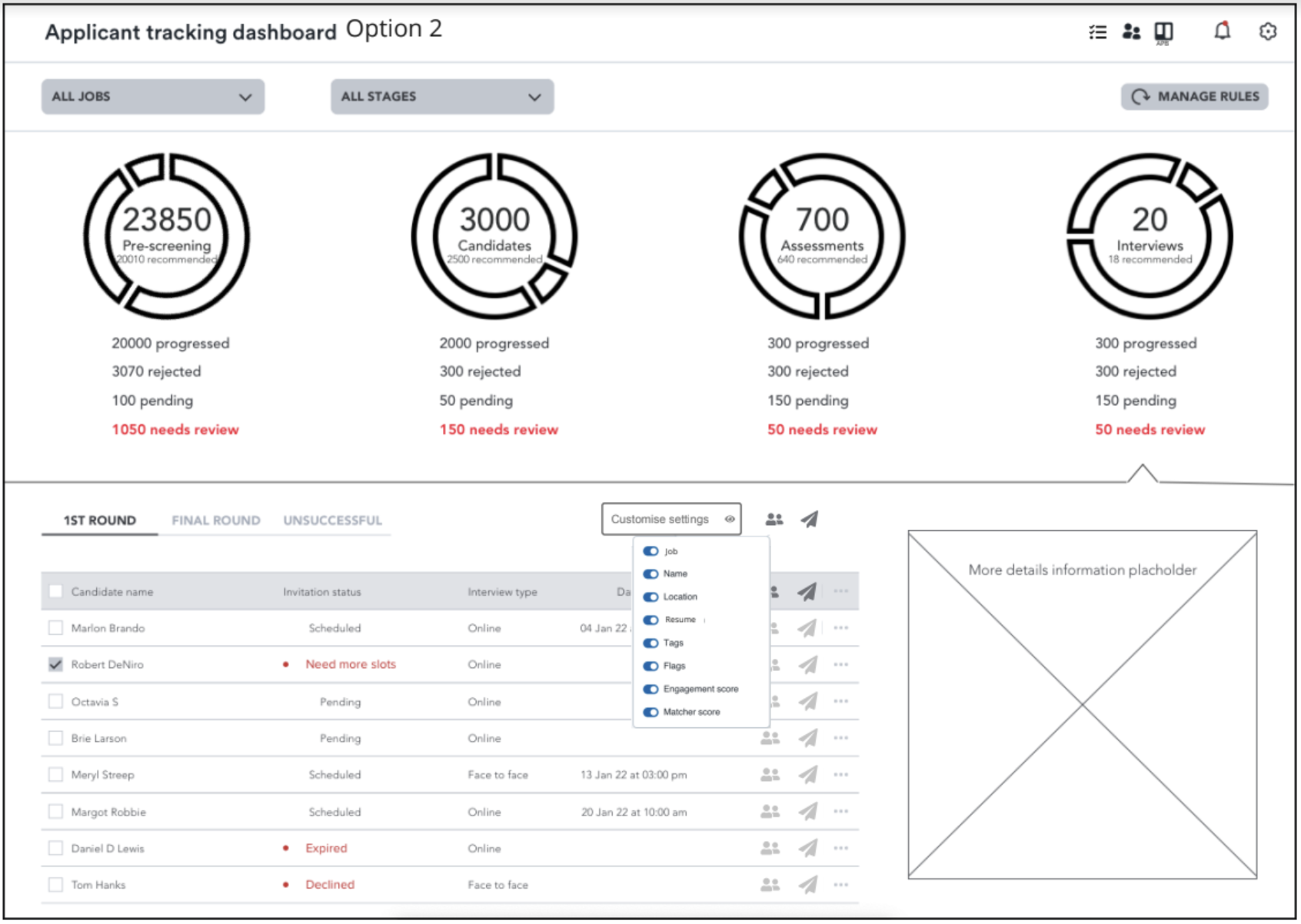
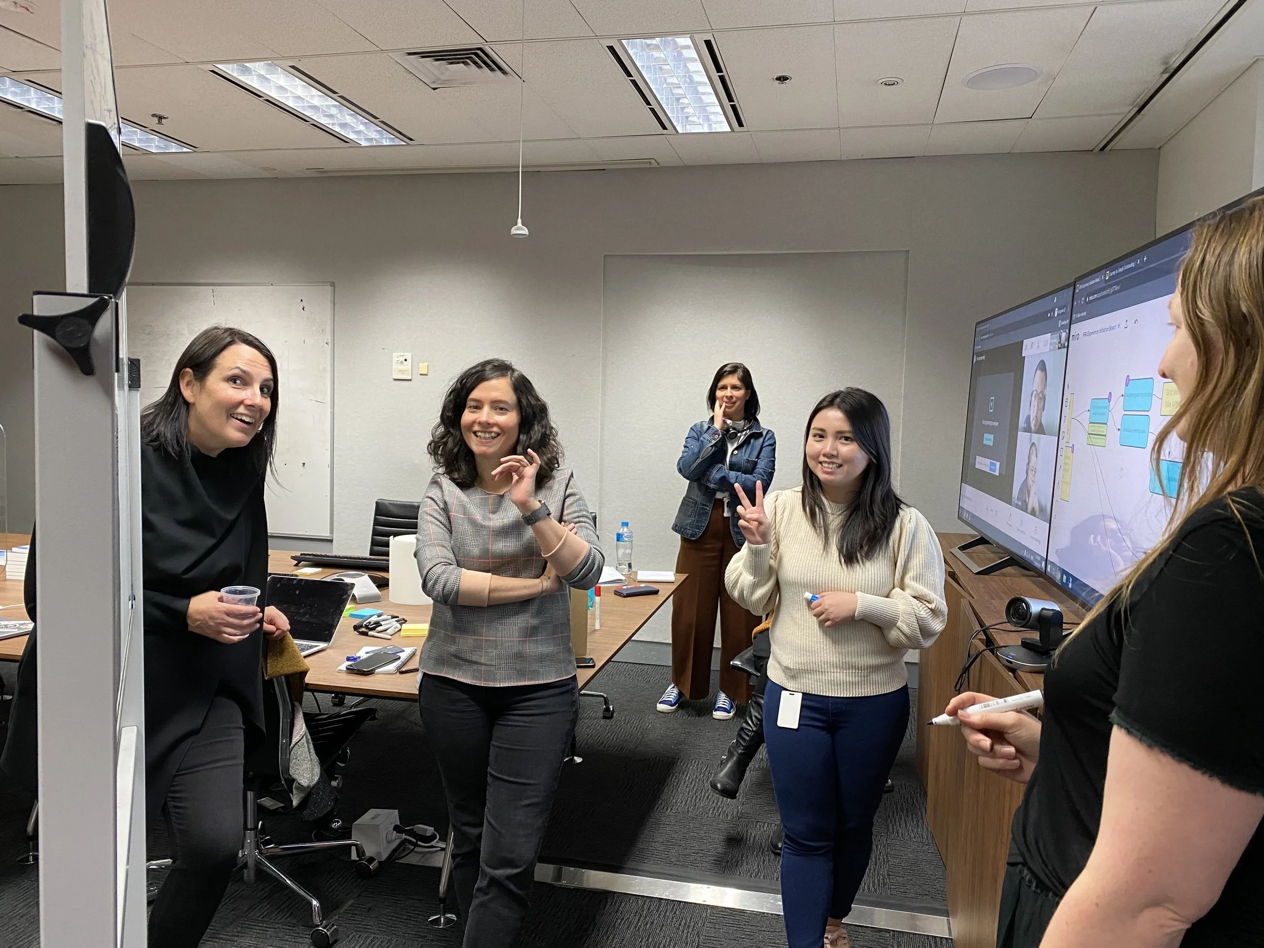
I organized a workshop with PMs, Designers, Tech Leads, and the Head of Experience to design a new user dashboard. We focused on two main needs: knowing what needs attention and tracking screening task progress. The dashboard lets users easily see where to focus and reduces unnecessary information. Users can also view detailed information like invitation statuses. We also created a rules engine for customization. It was our first in-person workshop after a year of lockdown, and everyone was happy.
Usability testing
Once there was the idea in a design form I had to quickly test the ideas with the identified early adopters so check the commercial viability of the product.
I ran the session with 5 clients to test if the idea meets their needs and will be interested in buying the functionality. And we got the green light from the buyers and superuser. Challenge here was I have not yet validated the idea with the actual users and hoping that the new solution will meet their needs.
Delivery
After confirming that the dashboard and rules engine idea could make money, we broke down the dashboard design to prioritize features and outlined the delivery for basic automated interactions. We split the design into 3 phases:
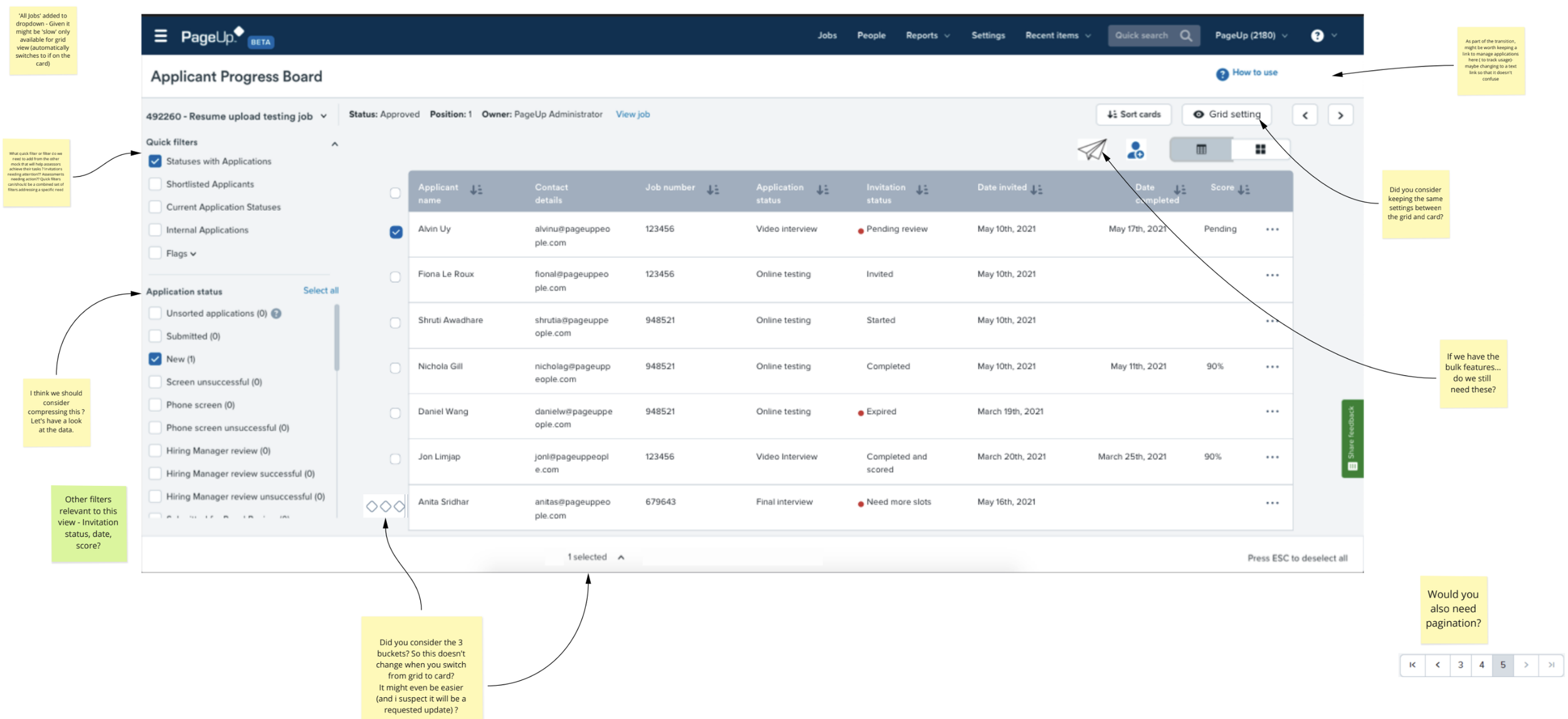
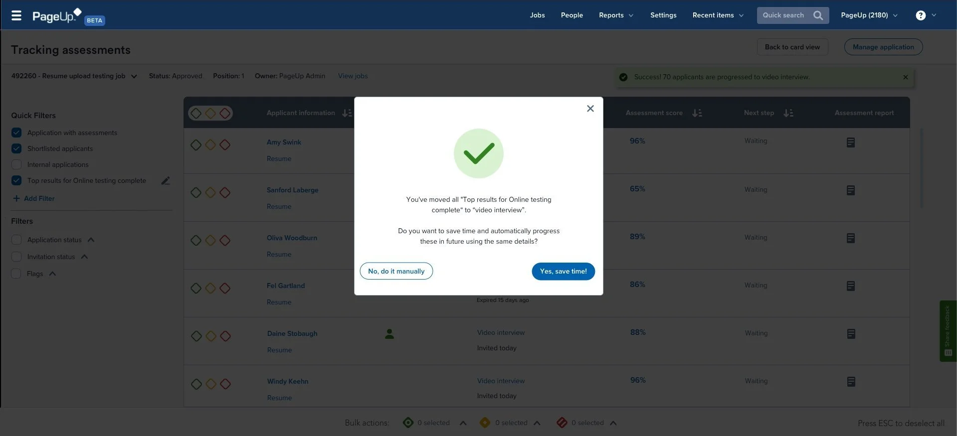
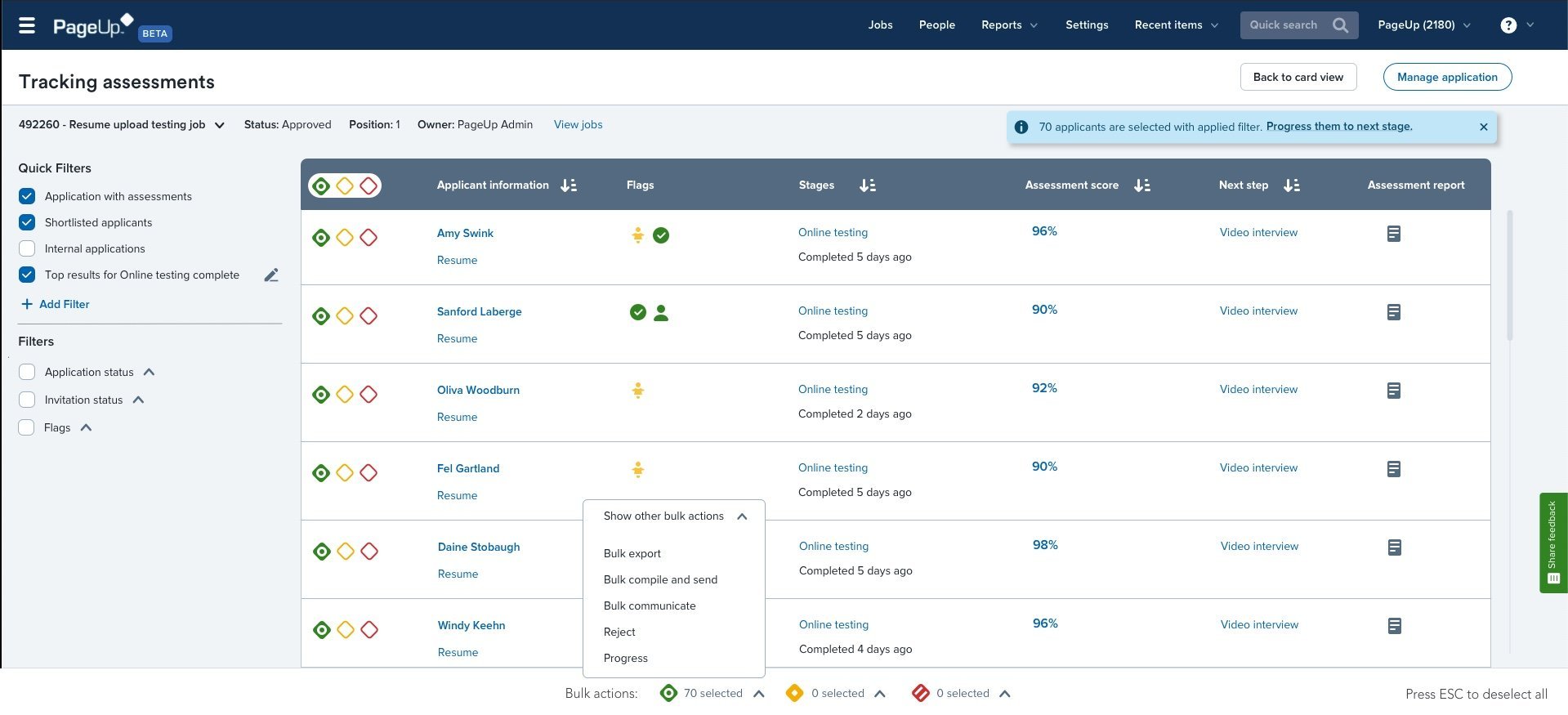
Tracking Progress: We started by detailing the dashboard section and turning it into a list view. We added a toggle for users to switch between card and list views, addressing a major user concern. This also allows us to save time by reusing components and enables users to easily see what needs attention and sort columns by scores.
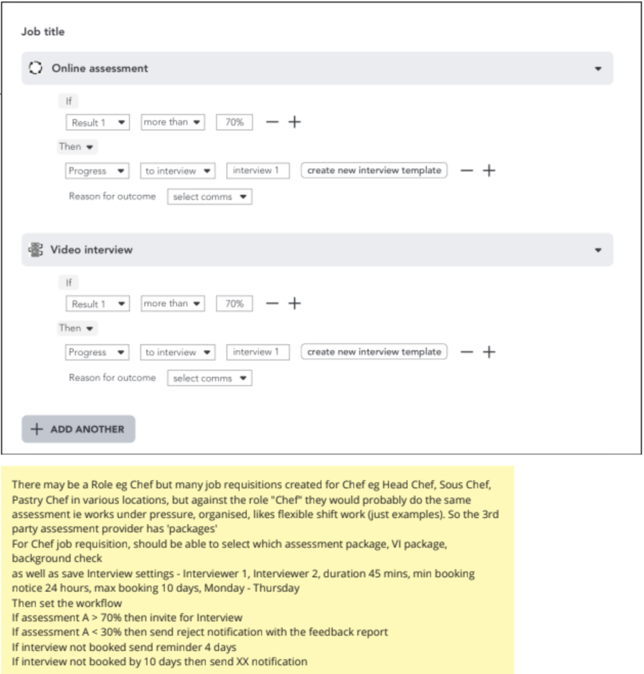
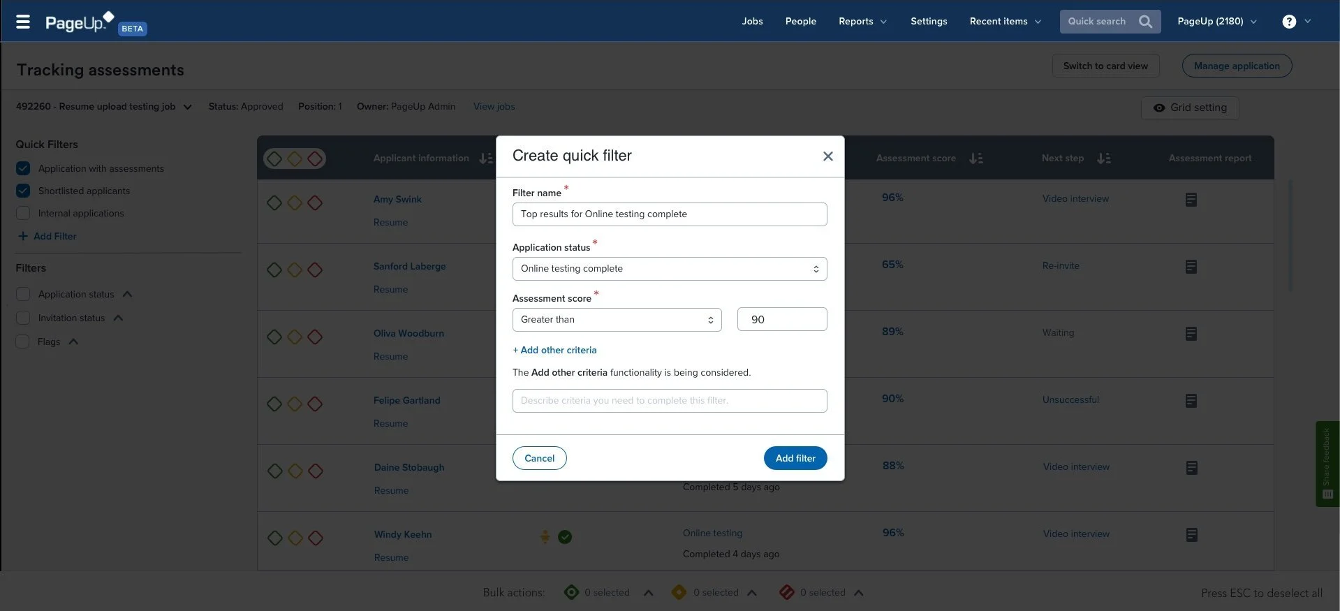
Quick Filters: Combining existing list view filters and rules engine design, this feature lets users set benchmarks to streamline candidate processing. For example, setting a filter to show candidates with scores above 70 will display all relevant candidates for quick progression.
Automated Invitations: This feature was the riskiest. It divides into two parts - firstly, the system selects candidates meeting user benchmarks and asks for confirmation to proceed. Secondly, it can automatically progress/reject candidates based on set benchmarks and notify users.
Hypothesis and measure of success
Assessment tracking
We believe that by providing the ability to track assessments and perform bulk actions in volume will result in piloted recruiters using Assessment Tracker over Manage Applications to track assessments
The measure of success: 40% of sessions with bulk action completed.
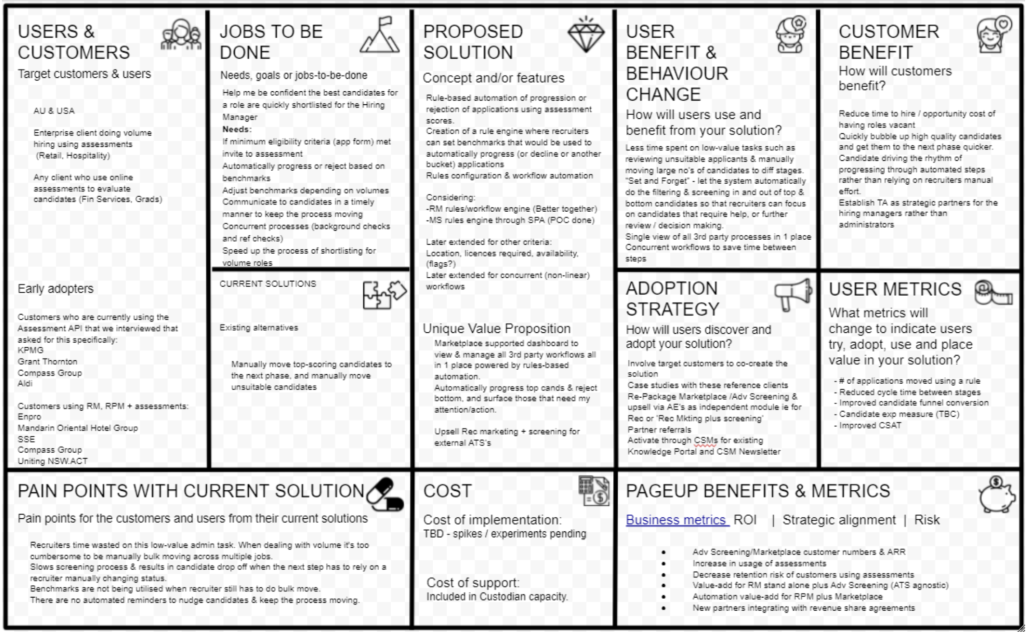
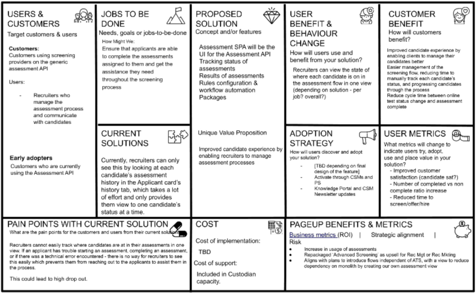
Opportunity canvas
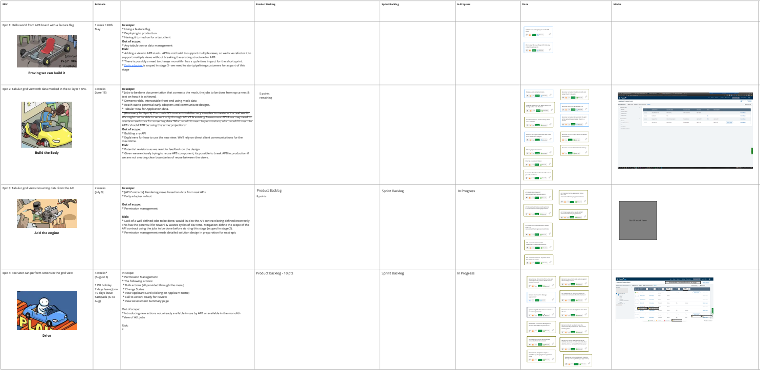
Epic slicing and story planning
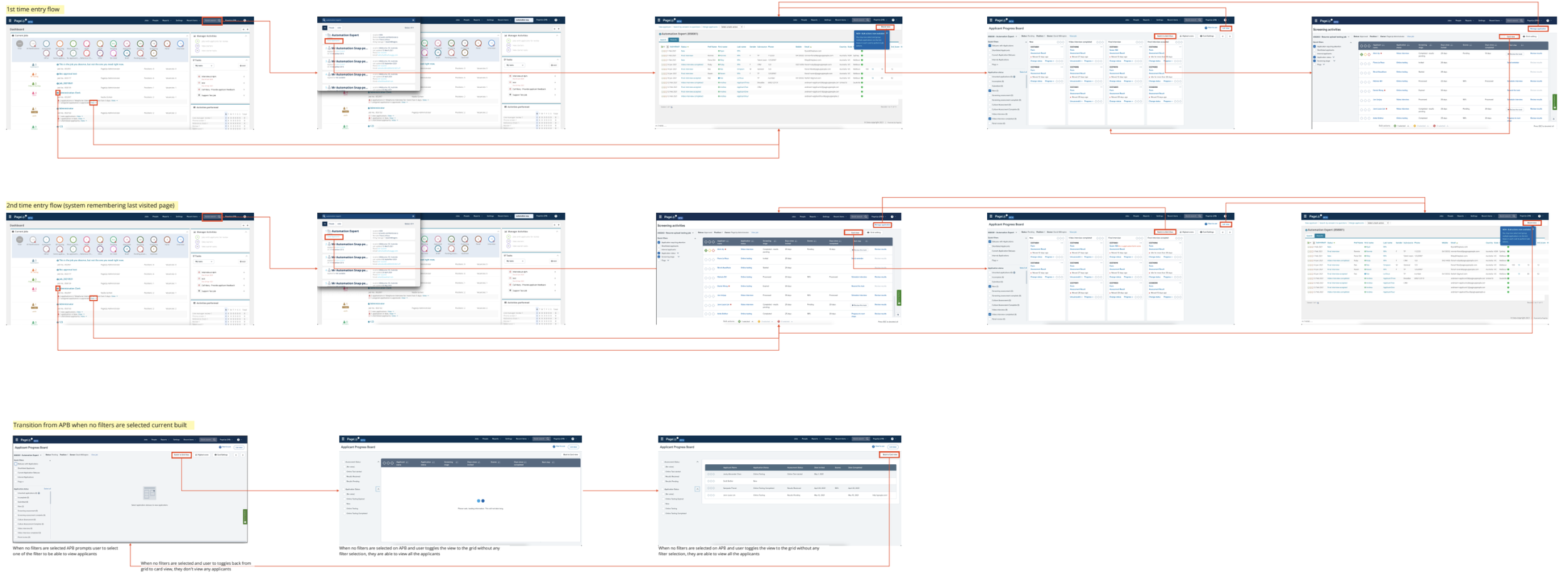
New User Flows
Creating filters
Quick filter
We believe that by giving the user control to define their own smart filter criteria (assessment score benchmark) will result in Increased confidence in automating reject or progression.
The measure of success: Increase in the number of users creating the filter and 3 users agree to automate this step for next time.
Automating invitations
We believe that if users could define the screening & selection requirements for a job upfront will result in Automated invitations without the need for further user input.
The measure of success: 80% of 40 unique users replies yes or no to the automation survey.
Final UI
To reach the final UI (still iterative) I had to refine the design at least 7 to 8 times working with other designers, constantly sharing the design in design critique sessions and doing usability tests, and validating the usability, navigation, memorability, and content of the interface.
I also build and few surveys using Qualtrics to learn if users want to automate the process, also recruiting them for usability research interviews.
First list view
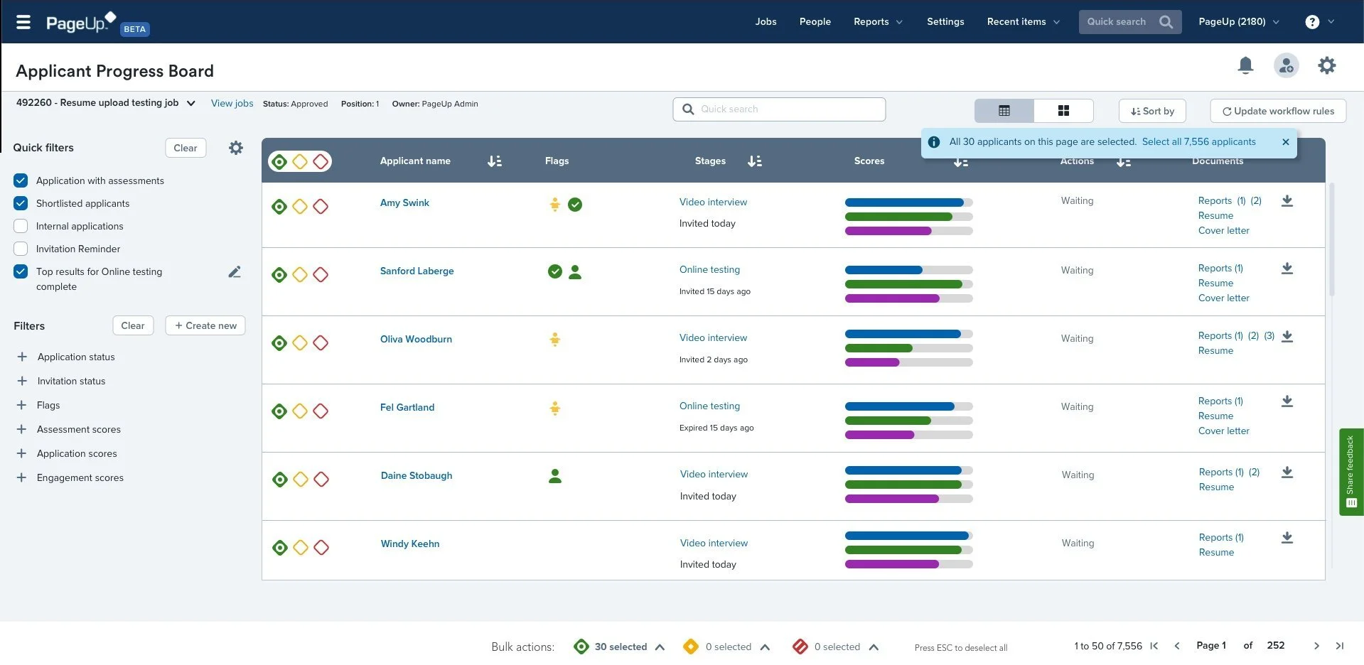
Automation experiment
And we achieved our OKRs with flying colours
Each Objective is measured by multiple Key Results. In scoring the Objective we score each individual Key Result with the average score of the component Key Results making up the final score for the Objective
How to score a Key Result
Key Results are either Impacts (e.g. number of new customers) or Tasks (e.g. launched new product) - in general, you are aiming to have only impacts - for the purposes of scoring we will look at impacts only.
The score for a key result is between 0 - 1 and is generally based on a percentage score for the impact. For example, if we have a key result to bring on 5 new customers and we only bring on 4 then our score would be 4⁄5 or 0.8
21Q3 Objective - Improve screening and selection efficiency and experience by increasing customer usage of assessment vendors through the generic assessment API.
KR1 - Migrate 3 of the top 5 vendors
KR2: Increase adoption by 5 clients Usage of assessments by 12%
KR3: Reduce ‘Time to Present to HM’ from 8 days (baseline) to 6 days
KR4: User exp satisfaction score > 5 (out of 7)